Reflections
Tuesday, April 21, 2009
9:00 AM
COMMENT PLS! (0)
i'm super duper proud of my portfolio and i felt arty-farty walking from sunshine plaza to bugis mrt and then taking the train from bugis back to simei. HAHA.
so so, i'm gonna post pictures of my portfolio up here. $45 ahhh. better be worth it! hmmmm.. (prays hard this won't happen) even if i don't do that well, at least i have a portfolio to call my own. it's like - every single thing from there came from my own hands (drawing, scanning, tracing, colouring, photoshopping). oh except for the storybook which was a collective effort. heh. i'm really proud of it :D

okay just one. all my assignments are uploaded here anyway!
i love nm2208. its the only module that can actually make me happy.
Final Project
Saturday, April 18, 2009
8:53 AM
COMMENT PLS! (0)
click to enlarge!
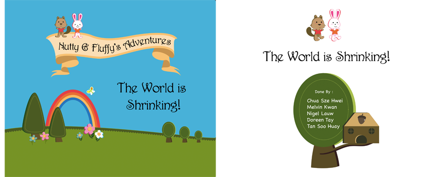
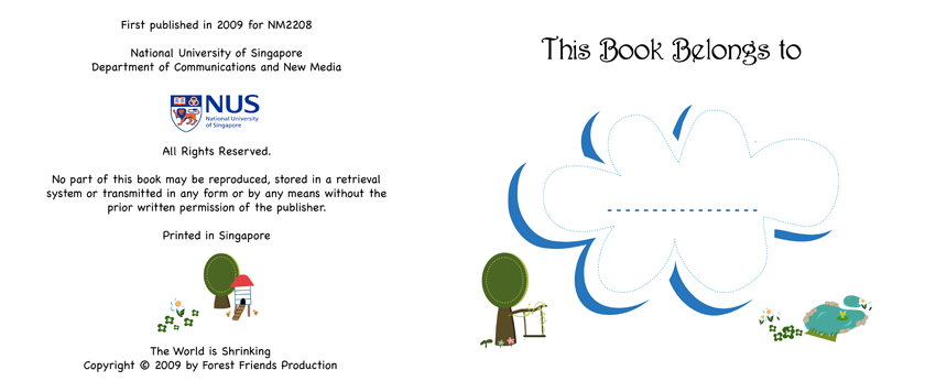
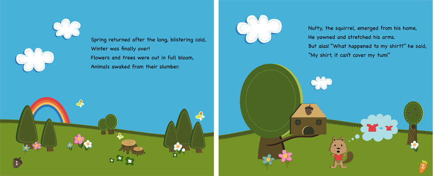
I LOVE THIS STORYBOOK! and love my groupmates even more :D
doreen, melvin, soohuay and nigel! they totally made this so great.
i contributed at the initial phase of coming up with scenes, and sketched a bit.
during this project period, my grandma was in very bad shape. i remember that friday where we met and were splitting work and all that and i just broke down - because i knew for sure that my grandma was passing. and that day was my sister's birthday (the closest grandchild to my grandma) and my father (grandma is his mother. he is the oldest child) was working on a ship. there were just so many worries in my head. fears that my sister's birthday might become my grandmother's death anniversary, and that my father wouldn't be able to come back to see her for the last time (he didn't make it in time for even the funeral.)
my groupmates told me to leave everything to them. and i never really understood the meaning of that till i came back to school about a week later and saw the storybook and everything. they really settled it all and it was so great. thank God for these groupmates. i wouldn't know what i would've been like without them covering for me :)
of course, i didn't leech on them for everything lah! was put in charge of the design document which i gave my best. had input from all the rest cuz there were some things that i was totally blur about having been away from school stuff for so long.
Assignment 5: My notion of Colourful Asia
Thursday, March 19, 2009
9:07 PM
COMMENT PLS! (0)
Final-est

My notion of colourful Asia! :) Language = a dominant feature of culture.
language in asia is indeed colourful as there are just soooooooo many different types. i'm Asian, yet i only understand the english and chinese version of the word. haha. so here's my postcard. loads of stuff going on under the huge 'ASIA', just like how it actually is in the continent. we are way too diverse to be classified and recognized as 1.
Back of the postcard

Initially wanted to play around with the placing of the stamp but I remember that my little job at Singpost made me realise that it's important to stick to the convention of stamp at top right side cuz that's how the machines 'scan' and 'chop' it. anything that isn't like that gets hand-chopped, which is a tedious process! so yeah. enough rambling on that. i decided to maximise the space on the card by having the address lines vertical - reason being, since it's gonna be always manually read, it's easy for postmen/women to just flip it around! so yeah. with that, there'll be more space to write loads and loads about ASIA! 47 countries leh.
Final Prototype - or so i thought

Thumbnails!

Comment 1: can consider pink as final
ME: Though a lot of people have said that the pink one looks good, i've decided to stick to the red one. Didn't wanna let appeal undermine meaning. And also give the wrong impression that Asia = feminine. Also, RED was chosen to symbolise ORIENTAL because I did a bit of research and found that RED was a very very common colour in flags of Asian countries.
Comment 2: determine focus of ASIA or the little words inside. cuz if focus is on ASIA, can change the words inside to red
ME: I took this into consideration and decided that the words INSIDE the big ASIA should be the focus instead, hence, my final-est of this assignment has the red words instead of the intial black ones. What's more important to me is for each country to be recognize for it's unique flavour. Not to be vaguely grouped together as 1 Asia.
Comment 3: COLOURFUL not really colourful. can consider changing the fonts / colours, or the word as a whole.
ME: I decided to retain the word colourful as it is not meant to be LITERAL. I thought of replacing it was the word 'diverse' but it just didn't click. maybe it's cuz the assignment states 'your notion of colourful asia' haha.
p.s. I TOTALLY ENJOYED THIS ASSIGNMENT! cracked my brains over what to do, but once i did it, it went so smoothly! and i love love love colour charts. i get an unexplainable high looking at blocks of colours placed side by side. haha.
my design is pretty simple - made up of words and shapes. so didn't take that much time to do it up. BUTTTT the conceptualizing stage was sooooooooooo tough lah! i thought of using food, people, flags and all that. but i couldn't see myself using those stuff to represent Asia. it seemed either too tough or too wrong. like it wasn't representative nor interesting enough. i'm glad i finally thought it using language. and that my computer supported most of the fonts haha. i totally made use of google translate for this assignment. thank God for all those man!
Assignment 4: Save, prevent, kill
Thursday, March 12, 2009
6:49 PM
COMMENT PLS! (0)
Final Poster

I realised that having the words 'mirror' (almost) the words at the bottom helped this poster achieve an equilibrum through symmetry. I didn't notice initially that my poster felt very top heavy. Now it seems much more.. balanced. Haha. I liked the condoms a lot. Coloured them pink and burned the sides a little to give it more depth. and the stickmen really look like they're inside! oh oh and i love my tag lines too. attention grabbing, big and bold - and they have a catchy ring to it as well. if put at orchard underpass escalators, very hard to miss. hahah. people might not have time to read the copy, but at least they get to read the 'save yourself, not on condoms' part!
Old prototype. :)

Got some problem tracing the sketch.. looks so deformed. :(
COMMENTS FROM CLASS:
-move 'save yourself' down to balance out the top and bottom
-make the condoms translucent, ie. blur the people inside
-maybe bg can be pink as well
-can remove the spots and move main pic to the right so that there's space for a proper caption
ME: took all of the above into consideration and came up with a second one above!
Brainstorming Process: I thought I was totally dry on ideas. I was, just that I just had a sudden burst of inspiration.
Was trying to think of ideas that were uncommon, but that wasn't a good idea because I'm not that creative.
Prevention of STD transmission is a commonly used topic. I saw that quite a lot of people have done that. Topics that initially came to my mind were 'save the trees' which is the ultimate lah. Not confident that i could do it in a brilliantly creative way so I tried thinking of other ideas. Another major one that came to my mind was "Stop hair abuse" - quite a unique topic but damn difficult to portray. I thought of all the captions, slogans, and words already. But couldn't decide on the images or cartoons or photographs. So, i decided to just stick to STD prevention. Namely, condom use.
Tried to give it a 'love' feeling. Hate those explicit ads that use fear tactics to make people use condoms. Decided that love is a beautiful thing. Sex is actually something beautiful. But as with love, it is unpredictable. Especially if someone has multiple partners. So that being the basis of my poster, I decided to portray a light-hearted mood, but with a slight precautionary feeling to it.
Class Exercise 2
Tuesday, March 10, 2009
12:34 AM
COMMENT PLS! (0)

Cluttered & Lively.
Cluttered - a messy network of circles squeezed within a small radius causing some to pop out.
Lively - a free, fly away-able kind of landscape.
Assignment 3: U C What I C
Thursday, March 5, 2009
8:00 AM
COMMENT PLS! (0)
my story - image heavy!

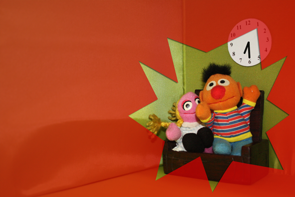
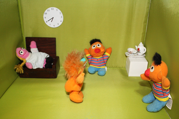
SPOILER ALERT!!!!
Girl A and her boyfriend spend time together in the afternoon. Boyfriend is seen in the next photo with another girl in the evening. Then Girl A appears and the couple is caught in the act. Girl A slaps
boyfriend and the last scene ends with 2 boyfriends in the photo. The boyfriends are in fact a pair of twins and she has mistakenly accused him of having an affair.
***
CONCEPTUALIZING
was told that having a story with a twist was much easier because a story without one would seem very flat. and nobody goes 'oh...' at the end.
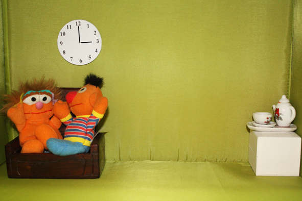
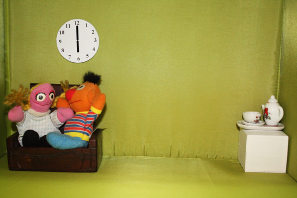
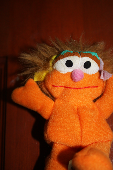
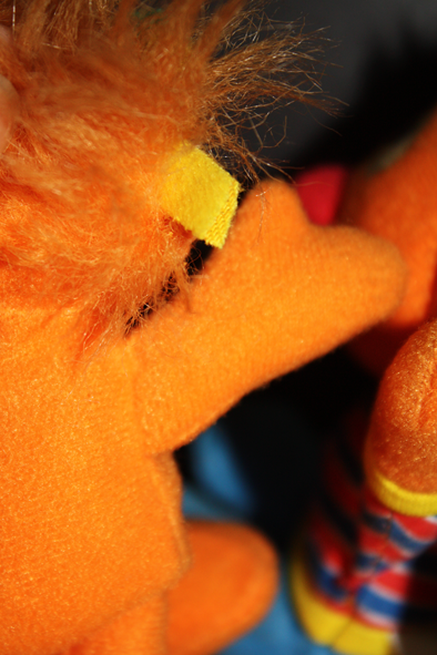
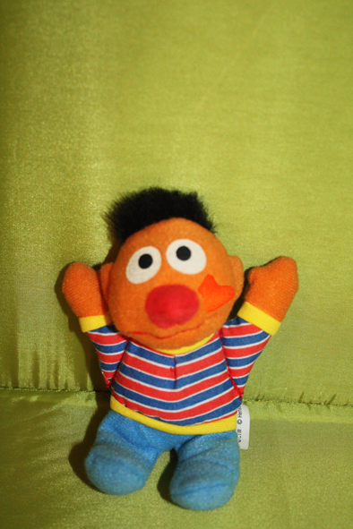
another tough assignment cuz i couldn't think of a proper storyline. till i was lying in bed one day and i saw my sesame street toys hanging on the wall. i always found it weird that i had 2 Ernies. haha. so there! that's when i thought of it. to have the Ernies as a pair of twins and have some misunderstanding happen!
Process
since i was using these, i had the advantage of arranging everything - the setting (house), furniture, where they stood etc.
but i didn't have the benefit of having EXPRESSIONS - which constituted a big part of photographs - especially photographs that told a story.
to overcome that, i made use of the angle perspectives: high camera and low camera angles to create vulnerable and threatening effects respectively. i made use of colour also to make the feelings more conspicuous. hope that worked out right!
Assignment 2: Degree of Abstraction
Thursday, February 19, 2009
4:20 PM
COMMENT PLS! (1)
Final Pictogram

So! here's my final pictogram. i think it'll be great to have it in the library. where we think that only nus students are around. BUT NOOOOO. a lot of people have lost their laptops there!!! so this would serve as a reminder to NEVER leave ur laptop unattended! even when you think it's 'safe'.
it can also be put in the canteen - i think that's the next common place.
and other benches and rooms around school that are not under surveillance.
6 Degrees of abstraction
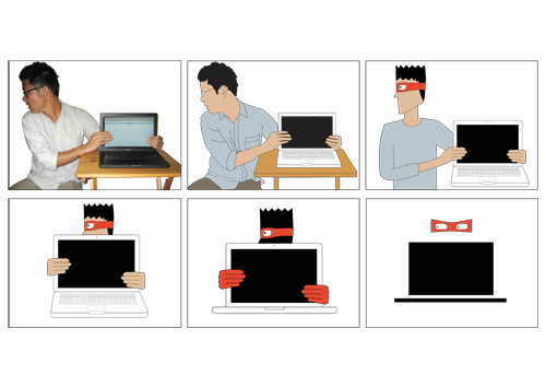
omg this assignment totally FORCED me to improve my tracing skills! traced every single thing - even the little keys of the macbook. but i think the effort paid off as i am quite satisfied with this one. especially from the original photo to the 1 step of abstraction. i had to tweak the angle of the right side of the laptop and table a bit in order to have a sensible tracing, if not it would just look distorted.
as i went along, i took out unnecessary details like the tshirt, table, etc. the last stage of abstraction was super abstract - too abstract cuz the mask and the rectangles were literally only representations and would only be understood if put into context. so i chose the second last one which is abstract enough but clear enough as well.
Featuring adrian the laptop thief!

An issue i thought was very serious in NUS was that of laptop thefts. 2 of my friends already kena-ed this and i think we as students and owners of laptops should take precautionary measures. sometimes it seems like it's safe but we never know who's lurking around and who's the thief.